Who knew that this past week was going to be something akin to national logo refresh week as both Google and Verizon revealed their new looks. As someone who in a previous life was an advisor to tech companies on branding issues, it should be noted that “modernizing” a company logo is both non-trivial as process and actually quite important in terms of market awareness. After all, nobody wants to be perceived as an “old fogey”, particularly in an age where perception now more than ever thanks to the megaphone we call the Internet matters immensely.
With that said, let’s look at the before and after results to see if both companies have achieved their stated objectives.
Verizon is first up with the new checkmark.

It replaces the 15 year-old:
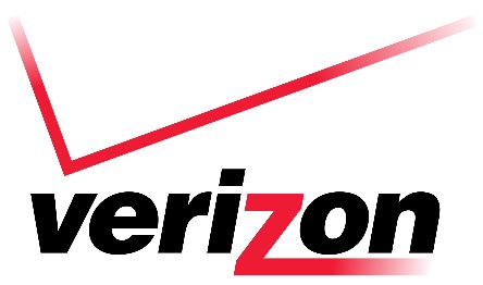
You can read the full explanation as to why the change here. The essence is that: “The new brand identity takes the best elements of Verizon’s heritage, represented by its colors and the Verizon ‘checkmark,’ and transforms them for a new era. At its most basic level, the new logo is a visual statement that honors our history and reflects an identity that stands for simplicity, honesty and joy in a category rife with confusion, disclaimers and frustration. It’s a cleaner, more human design and the checkmark, the universal symbol for getting things done, uniquely expresses the reliability of Verizon.”
While I agree this is a cleaner more modern look, my one reservation is that checkmarks have a connotation of something being done, but not necessarily done well. The addition of a “+” might avoid the perception of merely finishing a to-do list as opposed to a connotation of excellence. However, that probably is knit-picking.
As to Google you really need to watch the video below where Google describes the string of logos it has evolved over the years.
We all are familiar with the basic Google four primary color logo. How could we not be? However, I happen to appreciate the simplification where they have made it so “E”verything will be under the big “G” that incorporates all of those colors.

Again, this is a matter of personal taste, but as with the Twitter bird and the Facebook “f” iconography can be just as important in building brand awareness as a word. Again, since such things are always a matter of personal taste, as an icon there is no mistaking whose logo that G represents even if we all had gotten the message with the old little blue “g”. As part of the rebranding I also like what Google has done with the new animated mic image that as the company says is an indicator of Google at work.
 Image via Shutterstock
As with Verizon, Google took to its blog to tout the virtues of the new branding which can be viewed here. Google explains: “This isn’t the first time we’ve changed our look and it probably won’t be the last, but we think today’s update is a great reflection of all the ways Google works for you across Search, Maps, Gmail, Chrome and many others. We think we’ve taken the best of Google (simple, uncluttered, colorful, friendly), and recast it not just for the Google of today, but for the Google of the future.”
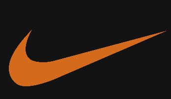
If a picture is worth a thousand words than an icon when it comes to marketing maybe worth more. Look no further than the Nike swoosh to understand this. Without having to even print the word Nike there is global recognition that conjures up what Nike obviously believes are positive emotions when we’re are looking for athletic gear.
It is why branding, particularly imagery is such a crucial part of overall brand stewardship.
Kudos to both Google and Verizon. Given the tech industries’ notable and historic lack of marketing prowess, with the exception of course of Apple and some of its competitors, in a word seeing this is “refreshing.” It will be interesting to see who is next.
Edited by
Maurice Nagle